Digital Sketchbook: July 2016

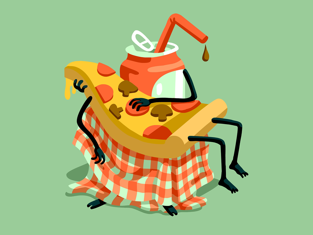
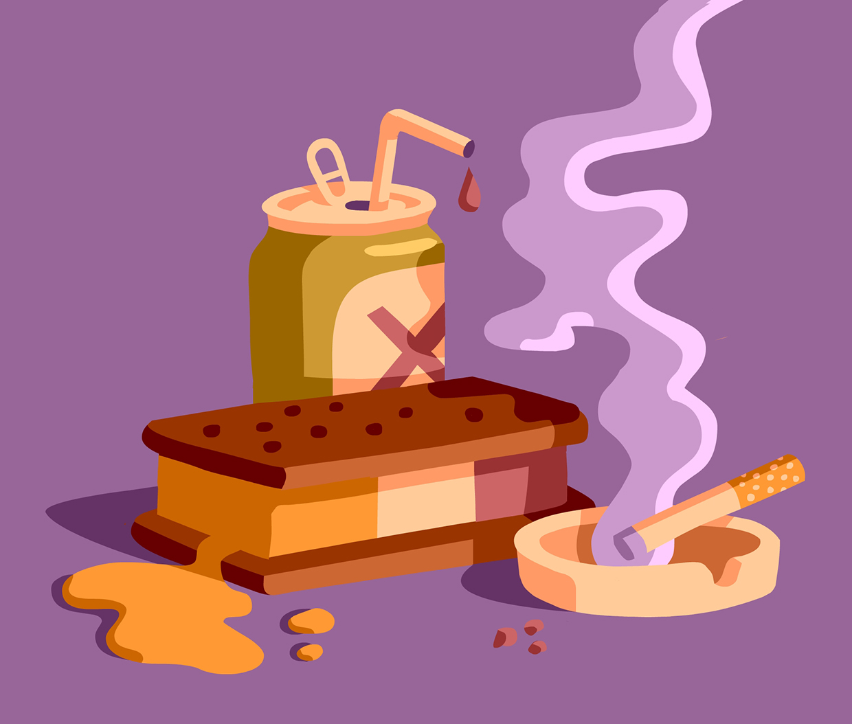
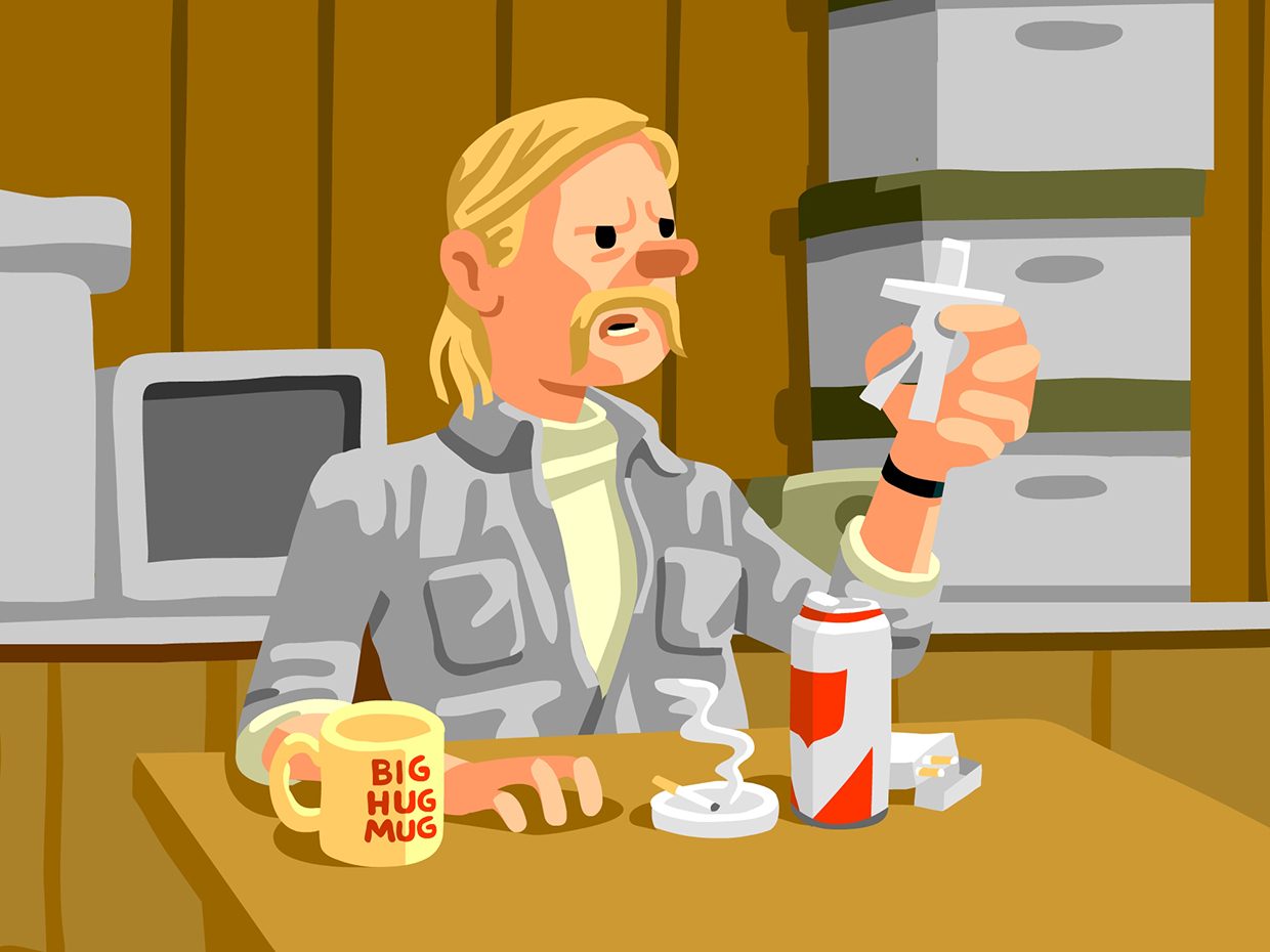
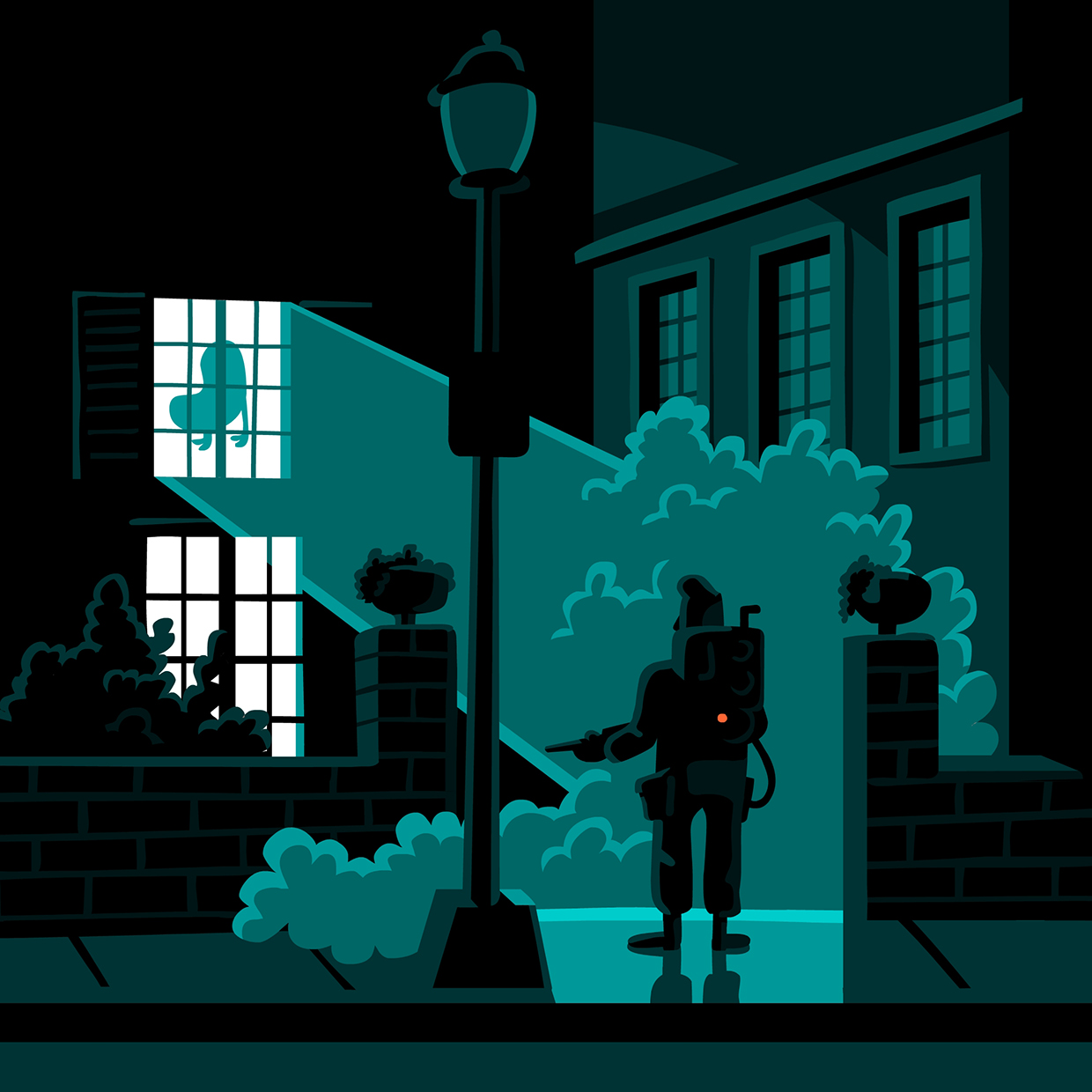
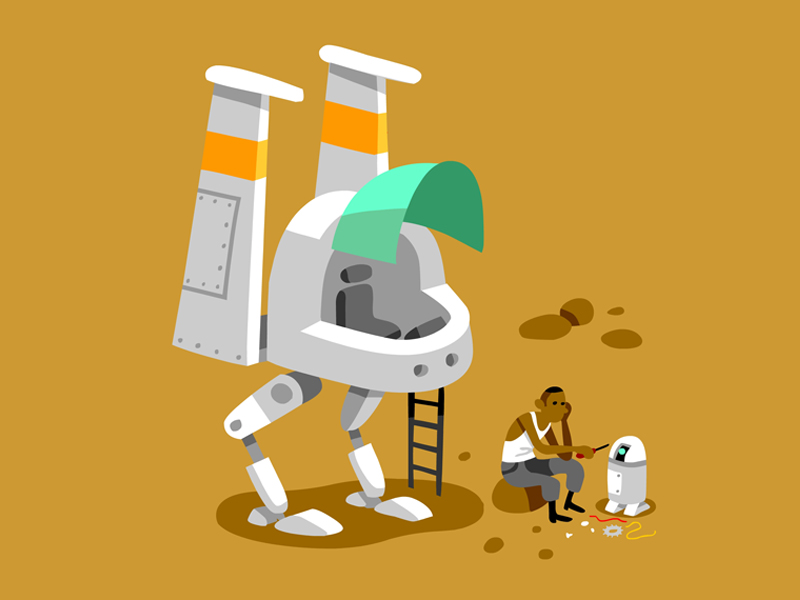
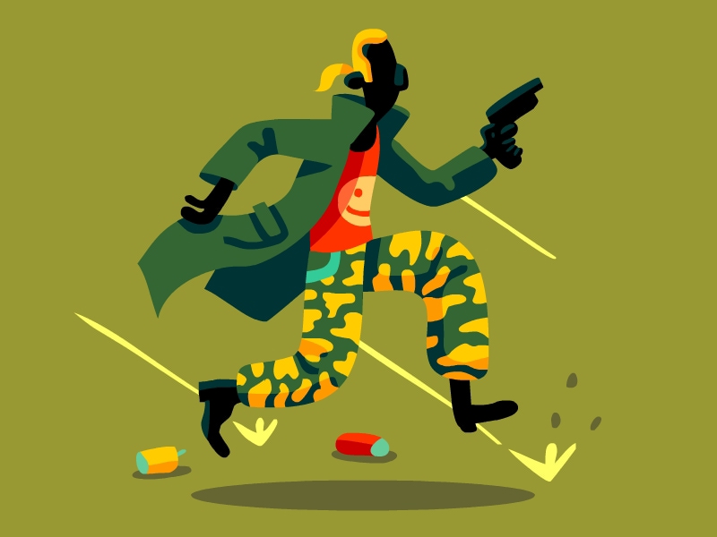
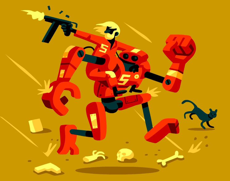
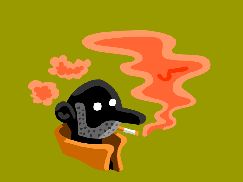
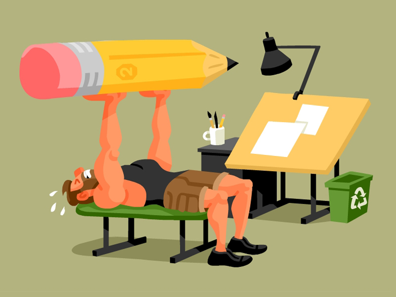
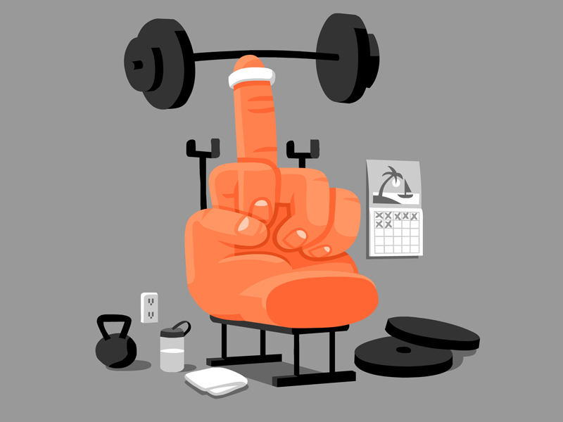
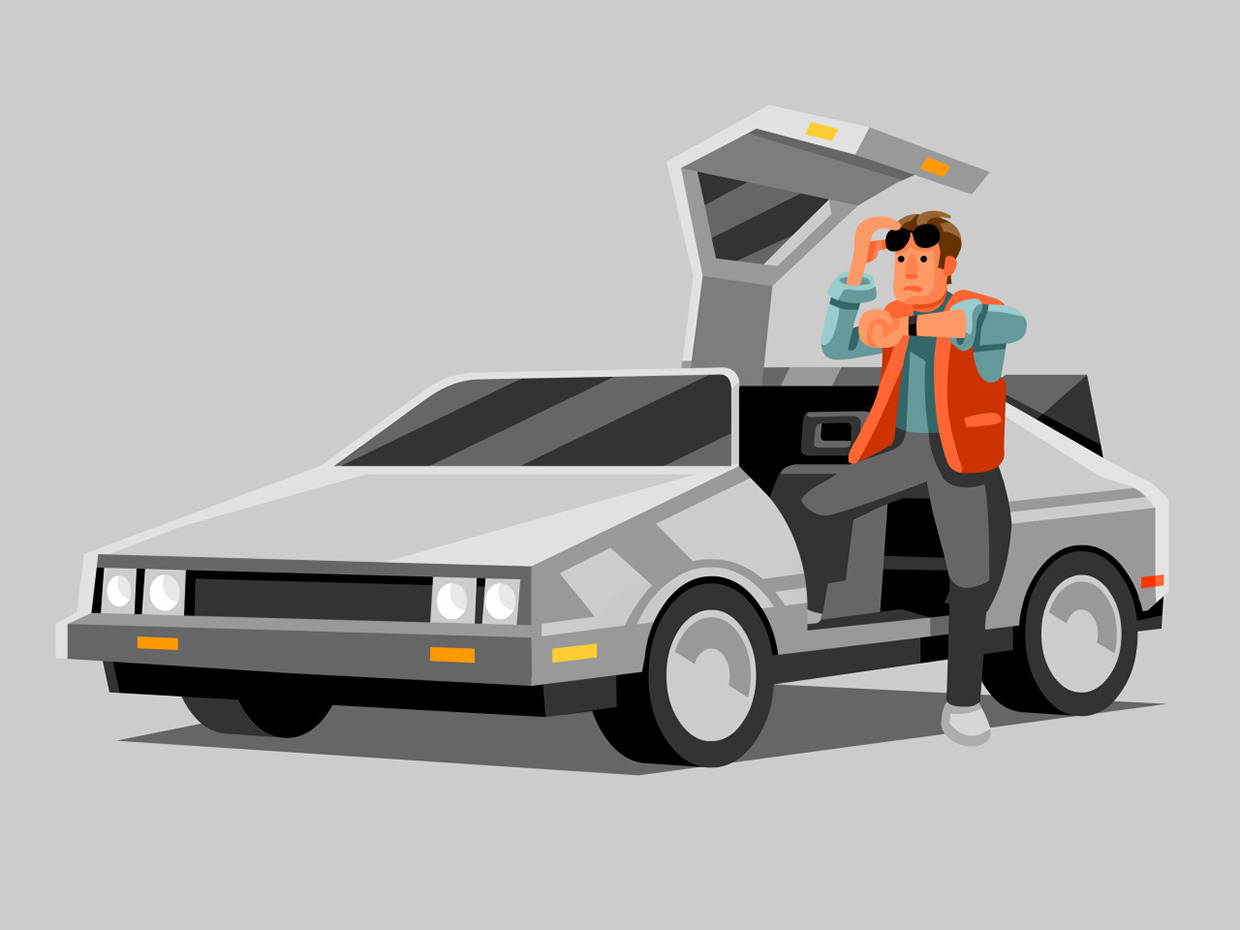
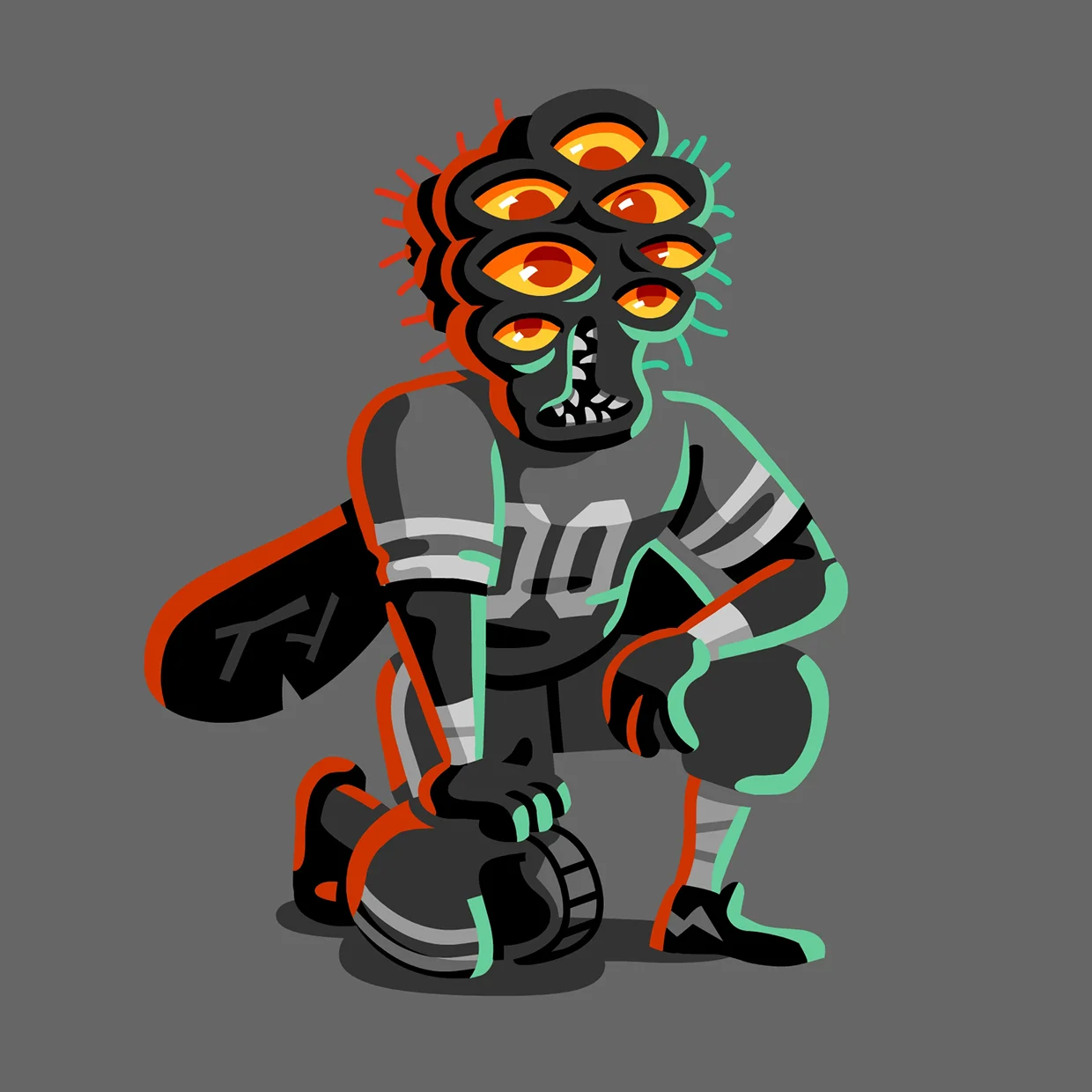
Greetings picture people! I started the year with a game plan that I deviated from almost immediately: To spend part of every work week creating drawings for myself. I was able to get a little rhythm going in January + February, but a couple of big projects in the Spring knocked me off my groove, and by the time May rolled around my resolution was a distant memory. I still think it's possible to balance client work & side projects, but I haven't quite figured it out yet. Finally, in June (six months later) I decided to give it another try. Here is the latest batch, made over the last month or two. Stick around till the end for a few sketchbook scans & a little more process rambling!

Sketches + Process Thoughts:

Since I've been starting from a little bit of a rut, I've been especially conscious of my process for these. Once I'm on a roll and have been posting new pictures regularly it seems to become a little easier, but for the first week or two of getting back in the saddle I really had to force myself. Every workday I've been starting with about an hour of free drawing time. For the first 20 minutes or so I've been just making lists. Writing down different topics that seem interesting (although at first I'm not feeling super interested in anything so they will be very general.) For example, a list might be: MONSTER TRUCK CULTURE, HIPPIES, VHS BOX ART. Then, when I have a couple of things that seem interesting enough to work off of, I'll start doing very crude stick figure sketches of different ideas. Starting with the most literal illustration of the list item, then iterating out different little riffs. After about an hour I'll be lucky if I have 1 idea that ends up seeming exciting enough to take into the rendering phase. 

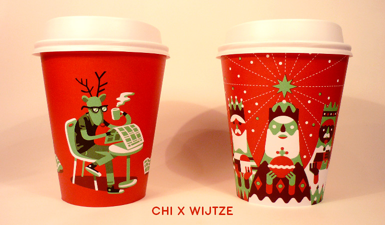
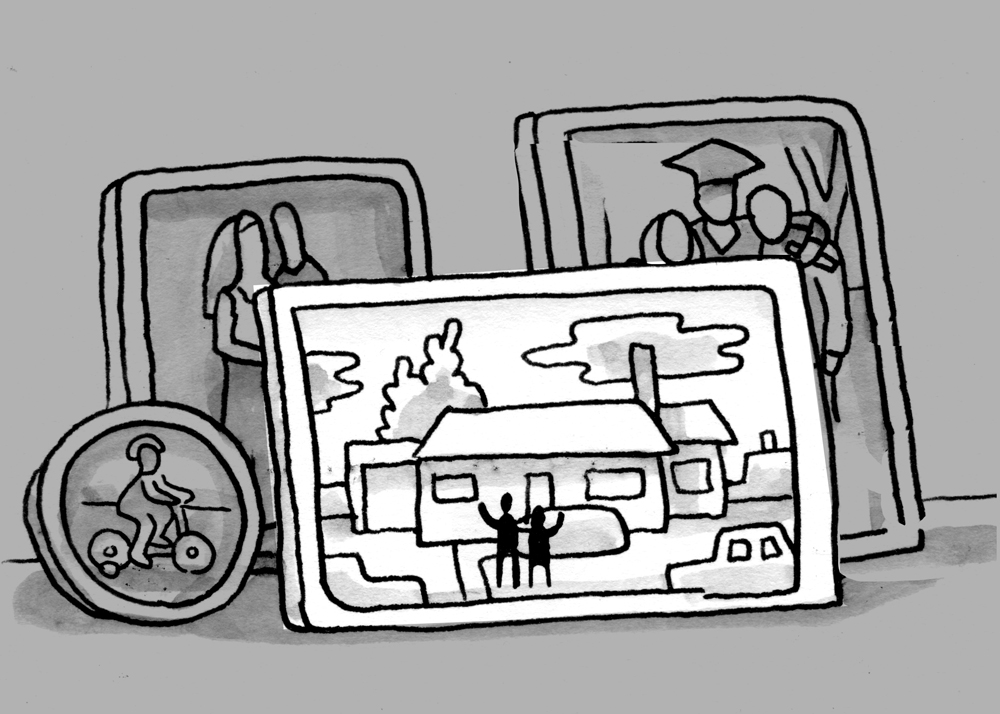
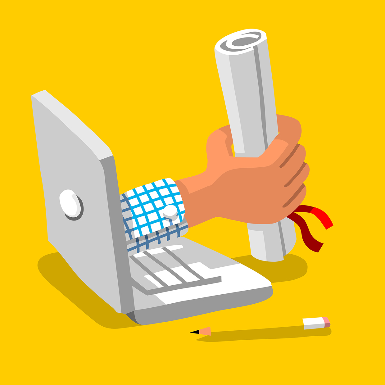
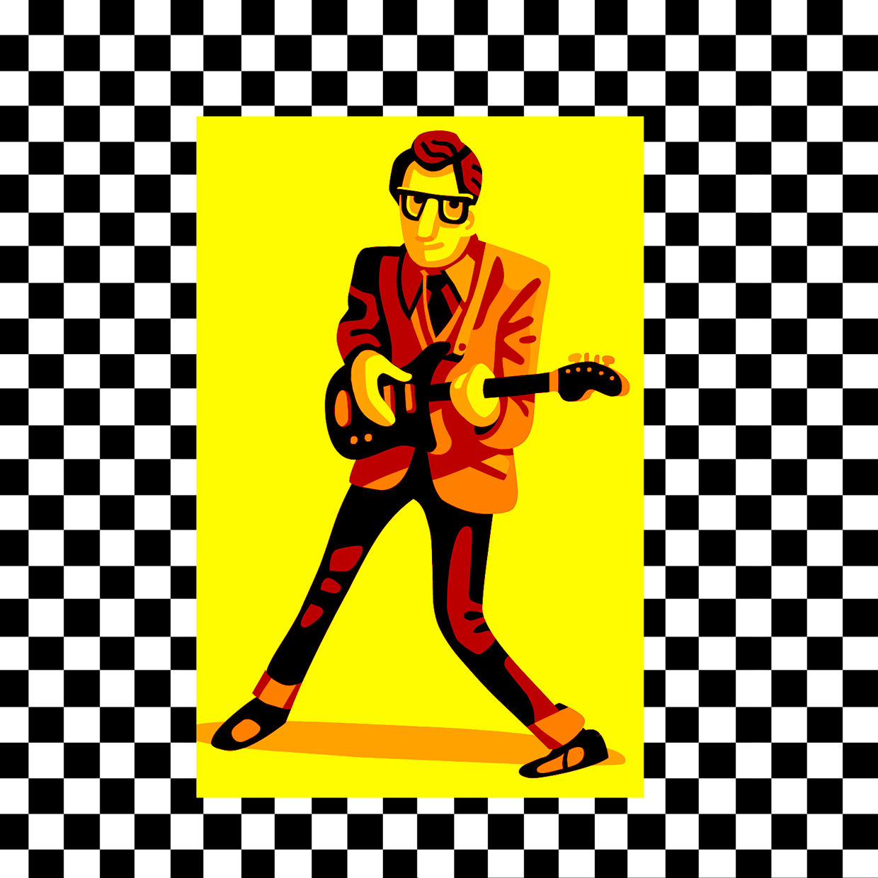
Here are some of the very rough sketches that come out of that process and led to the illustrations above.

IMG_1964 copy.jpg

Alright! Back to the drawing board.

Digital Sketchbook: March 2016

Digital Sketchbook: March 2016
 
Greetings picture people! I'm rummaging through my hard drive to scrape together the highlights from the last few months of assignments and personal projects. Over the winter break I did some re-evaluating of my studio priorities and came back to work in January recommitted to doing a little bit of drawing for myself every day. It seems obvious, but it's incredible how easy it is to get out of the habit. And when you haven't drawn any thing for fun in a week or two you kind of forget what sorts of pictures you like to draw, and your client work gets stale too. The big epiphany (such as it was) was that everything I've done that I've been proud of (work wise anyway) has started as a little idea in a sketchbook, so if I want to do better work moving forward, the logical place to start is my sketchbook. To that end, I've penciled in a daily 25 minute brainstorming/drawing session at the beginning of each day (modest, I realize, but I'm trying to commit to something I won't give up on.) At the same time, I've been picking a favorite sketch each week (or two) and taking it through the vector pipeline. (As always, it is so interesting to see how a little drawing I might completely dismiss in sketch form takes on new life when it has color and dimension.) The illustrations below are the results of that process, (with the exception one illo that was commissioned, but highly influenced by the doodling I was doing at the time.)

"Emoji Principle"
 
One other thing! Okay, just riffing on this idea, but I've been noticing certain patterns in which images take off on social media, and which ones languish, and I've been developing a little theory (based on completely subjective observation) but I thought I'd share it anyway. It seems to me that the art that has the biggest life online is the art that people can use themselves to express how they are feeling. Images that are stronger and clearer emotionally, either positive or negative, seem to win out over images that are clever, mysterious, or just beautifully composed. Ideally, I think, an image would be all of the above, but if it's not emotional, it's not useful as a tool for other people to express themselves, which is the main way that things are shared online. Obviously, I've just exposed myself as a "like" junky. Guilty as charged. But just for fun, I've ranked the images above in the order of there online success (as tracked by instagram likes.) Of course, you can't really make any kind of conclusions on such a small sample size, and the more successful images may have succeeded for some other reasons, but at least for me it feels like the attitude expressed goes from "Hell Yes!" at the top to just sort of a flat line of neutrality at the bottom. 
 
Allright! Back to work. See you next month:)

Digital Sketchbook: Vectober 2015

Vectober baby! I spent the last month trying to hit a target of putting out one drawing a day (and coming closer to 1 every 2 days.) It was a great way to kickstart my drawing brain after a little post-vacation rut. While I was working (because it's fall and I'm in a more reflective mood) I've also been thinking a lot about my drawing habits.

Ideally I would draw a little bit every day. But in reality I draw in month long sprints, seperated by nearly as much time where I am trying to get back into it. I seem to need to recommit myself to it about every two months. Without meaning to, the hours in studio fill up with email, coffee runs and plenty of just staring into space. And when I am working on an assignment, it's easy to justify cutting out the extra hour of drawing I do for myself. Then, as soon as I do, I forget how much I get out of it, making it that much harder to get started again. On top of that, it seems like the longer I am away from a sketchbook, the more impossible my expectations get for what I'll do when I get started again. Even though my drawing brain is dormant, my idea brain is going into overdrive. By the time I break out a pencil, not only am I totally rusty on the fundamentals of drawing, I am expecting myself to dive right into an ambitious cohesive project. 

The upside of going through this cycle so regularly is that I've started to figure out a strategy for bypassing my hangups and just getting back to work. What works best for me when I'm trying to get started again is to throw out any ideas I have about what the drawings will look like, or what story they will tell. What I try to focus on instead is hitting a minimum time limit of drawing every day, and putting my effort into color and design, rather than concept. Whatever ideas actually end up in the drawings happen while I'm drawing, or in the hours between drawing sessions when I'm already warmed up. At some point, I'd like to figure out a way to do something with those "big ideas" I come up with on breaks.  For now I just write them down, and hope that my attention span will catch up with them eventually. 


Digital Sketchbook: September 2015

Usually my sketchbook is a place for me to take a little break from the screen and flex my drawing muscles without burning myself out on the tools that I use for my commissioned work. However, as a result, I fear I might not be giving myself the chance of stumbling upon new ways of taking advantage of my vectors. I had slow couple of weeks anyway, so I decided to move my sketchbook habit over to the Cintiq. One hour of drawing every work day for two weeks. Some days worked better than others, but I definitely felt a lot looser with my digital drawing by the end of the experiment, and ended up with a couple of weird little ideas that I hope to explore further.

Illustration Roundup: September 2015

I've been changing up my digital drawing strategy for the last couple of months, and feel like I'm starting to get a better handle on what exactly it is that I do stylistically. There has always been a little disconnect for me between the way that I draw and paint in my sketchbook, and the way that I work with vector. I couldn't quite put my finger on it, but I think it comes down to the fact that when I make my 'finals,' I am basically copying something that I have already drawn once. Since I'm not making decisions on the fly, as I do when I'm building up something in graphite or ink, one little detail at a time, the results sometimes feel a little flat. And, a lot of times, a design decision that makes sense in a line drawing doesn't really have the same punch in flat color shapes. So, as much as possible, I've been trying to save all the fun for my finals, and resisting the impulse to make my sketches stand alone a pleasing little drawings on there own. (Not that they were masterpieces to begin with, but, you know what I mean.) Now it's "just the facts," then add the razzle-dazzle (such as it is) in post.

My Brain: The All-Hands MeetingThe New YorkerAD: Deanna Donegan

My Brain: The All-Hands Meeting
The New Yorker
AD: Deanna Donegan

The Green PrintersPrint ad for JakprintsAD: Ted Barnes

The Green Printers
Print ad for Jakprints
AD: Ted Barnes

Dictionary Grudge-MatchMental Floss MagazineAD: Lucy Quintanilla

Dictionary Grudge-Match
Mental Floss Magazine
AD: Lucy Quintanilla

What's (one of the) the Oldest Words in the English Language? (A:Two)Mental Floss MagazineAD: Lucy Quintanilla

What's (one of the) the Oldest Words in the English Language? (A:Two)
Mental Floss Magazine
AD: Lucy Quintanilla

What do you call the metal part of a pencil? (A: Ferrule)Mental Floss MagazineAD: Lucy Quintanilla

What do you call the metal part of a pencil? (A: Ferrule)
Mental Floss Magazine
AD: Lucy Quintanilla

What do you call the arm hole in a shirt sleeve? (A: Armsate)Mental Floss MagazineAD: Lucy Quintanilla

What do you call the arm hole in a shirt sleeve? (A: Armsate)
Mental Floss Magazine
AD: Lucy Quintanilla

What do you call the holes in Swiss Cheese? (A: Eyes)Mental Floss MagazineAD: Lucy Quintanilla 

What do you call the holes in Swiss Cheese? (A: Eyes)
Mental Floss Magazine
AD: Lucy Quintanilla


A huge thanks to Deanna Donegan, Ted Barnes and Lucy Quintanilla for the great assignments!


Illustration Roundup: June 2015

The summer is finally here. I've been riding my bike to studio in the mornings, and timing my bike ride home to sunset every night. Looking over the things that I've been working on I definitely think some of that energy is making it's way into my sketches and finals as well. In December I was struggling to think of any color schemes besides blue and pink, but for the last couple of months I feel like I've been expanding my territory on the color wheel. My motto of the moment: More action, more color, more razzle-dazzle!

Dad BodsNY Times AD: Nicholas Blechman

Dad Bods
NY Times 
AD: Nicholas Blechman

This was a fun one for a data driven piece on "Dad Bods" for the NY Times's Upshot blog. I took this in the middle of a much more complicated assignment and I think it gave me the confidence to leave this one a little more clean and graphic. (Sometimes I feel like I am cheating if I don't fill the rectangle with information, which is fine as long as all it's all adding to the story and not just frantic arm waving.) Thanks to Nicholas Blechman for the assignment!

Start to FinishCrain's ClevelandAD: Rebecca Markovitz 

Start to Finish
Crain's Cleveland
AD: Rebecca Markovitz 

An infographic for a story about the supply chain of a Cleveland based printing company for Crain's Cleveland. Recently I've been getting the chance to do a lot of these infographics and I've really been loving working on them! In the last year I've been moving away from doing so many spots, but they're kindof a blast, and even more fun when I get to do the layout as well. I still feel like my eye for certain graphic design basics could use some tuning, but it has been fun to be learning something new. Thanks to Rebeccas Markovitz for the assignment! 

Medecine WalkNY Times Book ReviewAD: Nicholas Blechman

Medecine Walk
NY Times Book Review
AD: Nicholas Blechman

A quick spot for the review of a novel in the NY Times Book Review. I'm always happy when I can pivot to landscape drawing in an assignent. I probably spent 80% of the time on this one trying to get those little silhouettes to feel right. Still want to go back in and tweak them now, but I will let them be. Thanks to Nicholas Blechman for the assignment!

Jailbreak CakeMental FlossAD: Winslow Taft

Jailbreak Cake
Mental Floss
AD: Winslow Taft

Pie KidnappingMental FlossAD: Winslow Taft 

Pie Kidnapping
Mental Floss
AD: Winslow Taft


Marzipan SculptingMental FlossAD: Winslow Taft

Marzipan Sculpting
Mental Floss
AD: Winslow Taft

These three illustrations were for the "Pastry Issue" of Mental Floss. This is the 2nd or 3rd time I've gotten the chance to work with them and I always stoked with the stories they have me illustrate. These three are for stories about (1.) actual cases of files, keys and weapons being smuggled into prisons via cakes, (2.) A criminal case involving a kidnapped pie and (3.) Da Vinci's penchant for using marzipan as a sculpting material. Thanks to Winslow Taft for the great assignment!

Post Hunt CoverWashington PostAD: Beth Broadwater

Post Hunt Cover
Washington Post
AD: Beth Broadwater

Last but not least, I spent the better part of April working on this cover and three spreads for the Washington Post Magazine for their annual scavenger hunt issue. This was a total dream job and the editors were great to work with. From a lifestyle standpoint I can also say that working with this sort of lead time makes for a much more peaceful studio schedule! A huge thanks to Beth Broadwater for the great assignment!

Join Us (interior spread)Washington PostAD: Beth Broadwater

Join Us (interior spread)
Washington Post
AD: Beth Broadwater

Opening Questions (Interior Spread)Washington PostAD: Beth Broadwater

Opening Questions (Interior Spread)
Washington Post
AD: Beth Broadwater

Clues (Opening Spread)Washington PostAD: Beth Broadwater

Clues (Opening Spread)
Washington Post
AD: Beth Broadwater

All right! That's it for this time. Back to the work!


Illustration Roundup: March 2015

Animals with human clothes! Board games as metaphors! Walk signs with self awareness! Let's do this.

Opportunity AnxietyNY TimesAD: Aviva Michaelov

Opportunity Anxiety
NY Times
AD: Aviva Michaelov

I got the chance to dust off the animation panel in photoshop this month. This was for a story on how the fear of the unknown can keep people from taking action when opportunities arrive. Thanks to Aviva Michaelov for the assignment!

Sespe SunriseAun ApprendoAD: Oliver Cornell, Randy Bertin

Sespe Sunrise
Aun Apprendo
AD: Oliver Cornell, Randy Bertin

This was a fun one for the alumni magazine of my old highschool (go Coyotes!) One of the big traditions of the school was a yearly trip up to king's canyon. They would give us a list of supplies we had to put together before we headed out, and for some reason wool pants were mandatory, so I went to a thrift store and got these ancient wool army pants that were as stiff as cardboard and about as comfortable. Somehow, everyone else had realized they should just bring the normal pants they always wore. Formative experiences. Thanks to Randy Bertin for thinking of me for this! 

Cuba NumbersNewsweekAD: Mike Friel

Cuba Numbers
Newsweek
AD: Mike Friel

This was a piece for Newsweek's "Two Number's" column, for a story on lifting of the travel embargo to Cuba. I was working on this while all the controversy about Edel Rodrigez's cover was going on, and I found myself scrutinizing this depiction of Cuba for any potential cultural insensitivities. Thanks to Mike Friel for the assignment!

I thought I might want to use this as a promo, so I reimagined it as a promotion for an imaginary airline. (Then I googled Aero Cubana, and it's actually not as fictional as I thought.)

Coding LandCrain's Chicago BusinessAD: Karen Freese

Coding Land
Crain's Chicago Business
AD: Karen Freese

I designed this game board for a story opener in Crain's Chicago Business. (The story compares the value of 10 week "Coding Bootcamps" with more traditional 4 year universities.) When I was a kid I played "The Game of Life" once, and was kind of confused by the rules, but really loved the board itself. It was at a cousins house, so I only saw it once, and after the fact it became more beautiful and complicated in my mind. Looking it up on image search now it is pretty standard. My imaginary version looked more like the Game of Thrones intro. Thanks to Karen Freese for the assignment!

Illustration Roundup: February 2015

After a few months of holidays, trips back home, and apartment relocations, I am officially back on the job! It seems like I am only now starting to get back into the studio, and I can't believe it's already February. Nevertheless, there were a few jobs I was able to squeeze into the cracks since December or so.

ADOBE: Michael Gough Tribute
This one was a lot of fun! Adobe’s XD team commissioned me to design a poster as a send off gift for their boss and mentor Michael Gough. This was a dream job in every way. Best of all though, was knowing that the person receiving the drawing would be one of the central players in designing all the tools I had used to make it. Thanks to everyone involved in making it such a great experience, and a special thanks to art director (and all around awesome guy) Matthew Richmond for reccommending me for the job!

Michael Gough TributeAdobe XD TeamArt Directors: Dan Cooney, Jamie Myrold, Jeremy Clark, Josh Ulm, Kimberley Chambers, Matthew Richmond, Moeka Lowman, Phil Clevenger, Natalie Bosworth

Michael Gough Tribute
Adobe XD Team
Art Directors: Dan Cooney, Jamie Myrold, Jeremy Clark, Josh Ulm, Kimberley Chambers, Matthew Richmond, Moeka Lowman, Phil Clevenger, Natalie Bosworth

Michael Gough Tribute (Color Variation)

Michael Gough Tribute (Color Variation)

Chosen Sketch

Chosen Sketch

Alternate Sketch

Alternate Sketch

Silicon IslandSF MagazineAD: Pete Ivey

Silicon Island
SF Magazine
AD: Pete Ivey

This little beach scene was for a story in SF Magazine about a technology mogul (Larry Ellis, former CEO of Oracle) who has bought a small Hawaiian Island (well, not so small when I compare it to any of the islands I own) and is in the process of remaking something between a high tech resort and a utopian island fiefdom. (The “Dolphin Alert” is real, apparently, but I came up with the “Sunburn Warning” app on my own, so if any ios developers want to team up on this, shoot me an email.) Thanks to Pete Ivey for the assignment!

President AlumniUT ArlingtonAD: Brody Price

President Alumni
UT Arlington
AD: Brody Price

I don’t typically get the chance to do many portraits, but I made up for lost time with this one. This was for a story about the impressive amount of UTA alumni who go on to become presidents of other universities. To be honest, the framed portraits are all of people I made up. I did, however, get to sneak one of the my old teachers at SVA into the mix. (The esteemed Carl Titolo. Here playing the part of the painter. Hey Carl!)  Thanks to Brody Price for the assignment!

Hipster RudolphDrip for DripAD: Wijtze Velkema

Hipster Rudolph
Drip for Drip
AD: Wijtze Velkema

Lastly but not leastly, I got the chance to team up with the incredibly talented Wijtze Velkema to work on his very cool coffee themed side project Drip for Drip. Each month (or so) Wijtze invites a different illustrator to go head to head to design a pair of paper coffee cups themed around the nearest holiday. For the Christmas edition, I contributed this coffee swilling Rudolph, who I am now realizing is also a bit of a litter bug (although, perhaps those were there already when he sat down.) 
 
Alright my homies! That's it for this month. Back to the drawing board!

Illustration Roundup: December 2014

Winter is a great time for staying indoors with a Cintiq tablet. That's what I'm trying to tell myself anyway:) While I try to synthesize Vitamin D from the glow of my retina screen, warm yourself by the glow of my latest JPEGS.

Driving By the Old HouseBoston GlobeAD: Greg Klee

Driving By the Old House
Boston Globe
AD: Greg Klee

An illustration for a piece in the Boston Globe about a man’s relationship with his first house. He has moved years ago, but checks in on it from time to time, and watches as the neighborhood slowly changes until he can no longer recognize it. 
 
I had a lot of fun working on this one! I feel like I've been trying to draw the interior of a car forever, and can never quite get it to feel the way I want it to. I'm always looking for photo reference where you can see the dashboard and the driver's head at the same time, and apparently it's next to impossible.  This time I pretty much threw the reference out the window tried to make it up from scratch (ignoring laws of physics / perspective where necessary.)  Now that I've cracked the code I'll be trying to work car interiors every preoject. Thanks to Greg Klee for the great assignment!

Chosen sketch

Chosen sketch

Alternate sketch

Alternate sketch

Chief Technology PersonCEO MagazineAD: Hamilton Hedrick

Chief Technology Person
CEO Magazine
AD: Hamilton Hedrick

An illustration for CEO Magazine for a story about new laws that are stripping non-lawyer employees at law firms of the "officer" in their titles. I ended up rendering a slightly more naturalistic portrait for this one, and looking at it now am wishing I could blow up the features a little, but I guess that's just the pendulum swinging back towards cartooniness. Thanks to Hamilton Hedrick for the assignment!

Taxi AppsMoney MagazineAD: Patricia Alvarez

Taxi Apps
Money Magazine
AD: Patricia Alvarez

These are some spots I made for the most recent issue of Money Magazine. The feature is a round up of recent "Big Ideas" that change the way people invest (or live in general.) After working on a larger illustration, it is kind of fun to jump into these quicker ones. Sometimes these spots end up being a place to try new ideas without worrying too much if they will work. The wierd diorama perspective in the "Taxi App" probably would have gotten resolved into something more realistic if I'd had a weekend to rework it, but I'm really happy with the way it came out. Thanks to Patricia Alvarez for the great assignment!

Transparent Medical PricingMoney MagazineAD: Patricia Alvarez

Transparent Medical Pricing
Money Magazine
AD: Patricia Alvarez

Test-out DegreesMoney MagazineAD: Patricia Alvarez

Test-out Degrees
Money Magazine
AD: Patricia Alvarez

Pop-Up BankingMoney MagazineAD: Patricia Alvarez

Pop-Up Banking
Money Magazine
AD: Patricia Alvarez

Solar BoomMoney MagazineAD: Patricia Alvarez

Solar Boom
Money Magazine
AD: Patricia Alvarez

My Aim Is True"Thirty Three and a Third"Gallery 1988

My Aim Is True
"Thirty Three and a Third"
Gallery 1988


Last but not least, I'm very excited to have some work at Gallery 1988 this month. The show is a collection of reimagined record covers. The opening will be this Thursday, the 5th of December.Thanks to Dana Lechtenberg for inviting me to participate!